



- OpenAI launched ChatGPT Images 2.5 on 8 September 2026 — a new state-of-the-art image model, rolling out the same day to every ChatGPT, ChatGPT Work and Codex tier on desktop, mobile and web.
- Generation latency is down by up to 50% versus Images 2.0, alongside sharper detail, more natural lighting and richer textures.
- Reference photos hold up better. Distinctive features carry through, so a person restyled into a new setting still reads as that person.
- Editing is precise and durable. It changes only what you asked for, and quality no longer degrades as you keep editing across a long conversation.
- Four genuinely new tools in ChatGPT: Sketch (draw your idea, type
@Sketch), Templates (Poster, Merch, flyers, product photos), Comments (click an element and instruct it directly), and prompt sharing. - Two new API models: GPT‑Image‑2.5 Flare — the default, higher quality than GPT‑Image‑2 at 50% lower latency — and GPT‑Image‑2.5 Sunburst for premium work, more precise but slower.
- Transparent backgrounds and complex layouts are explicitly better, which is the difference between a picture of an asset and an actual asset.
- Scale, for context: people already create more than 3 billion images a week across ChatGPT Images and the GPT‑Image API models.
- Provenance: C2PA metadata plus invisible watermarking — useful, but strippable, and worth understanding properly rather than trusting.
Image models usually get announced with a gallery of impressive pictures and a version number, and it is genuinely hard to tell from the outside whether anything meaningful changed. Every release claims sharper detail. Every release shows you a beautiful sample. Six months later you are still fighting the same three problems.
This one is different in a specific way, and it is not the model weights. The interesting part of Images 2.5 is the four tools wrapped around it — because together they change image generation from describing what you want and hoping into something much closer to directing the work.
That is a bigger shift than a quality bump, and it is worth walking through properly. This piece covers everything OpenAI announced, everything visible in their own samples, the independent hands-on reporting, what the two API models are actually for, how to prompt the new tools well, what the safety measures do and do not achieve, and the questions the launch left open.
Everything here is sourced. Where a claim comes from OpenAI's own materials, it is marked as such — a vendor describing its own product is evidence, but it is not independent evidence. Full source list at the end.
What actually shipped
Here is the whole release in one table, so you can decide which sections below are worth your time.
| Change | What OpenAI says | What it means for you |
|---|---|---|
| Generation speed | Latency reduced by up to 50% vs Images 2.0 | Iterating stops feeling expensive, so you try more variations and land on a better one |
| Image fidelity | More natural lighting, richer textures, sharper detail | Less of the plastic "AI sheen" that makes an image recognisable as generated |
| Reference photos | Subjects more recognisable, distinctive features more likely to carry through | Restyle a real person or product and it still looks like the real thing |
| Precise editing | Edits only what you asked, keeping the rest of the details the same | Change the background without the model redrawing the subject's face |
| Multi-turn consistency | Earlier changes stay consistent; no quality degradation over many edits | You can edit ten times instead of restarting when edit four goes wrong |
| Instruction following | Better at complex visual instructions and complex layouts | Detailed creative briefs drift less as they get more specific |
| Real-world information | Images containing real-world content are more accurate | Infographics, maps and labelled diagrams are less likely to be confidently wrong |
| Transparent backgrounds | Handles more complex layouts including transparency | Logos, stickers and cut-outs you can actually place into a design |
| Sketch | Draw directly in ChatGPT as a visual guide | Specify layout by drawing it instead of describing it in words |
| Templates | Presets for popular formats — Poster, Merch, flyers, product photos | A structured starting point instead of a blank prompt box |
| Comments | Place comments directly on images for focused editing | Point at the thing you want changed instead of describing which thing you mean |
| Prompt sharing | Share the prompt along with the image | A good prompt becomes a distributable asset that travels on its own |
| API | GPT‑Image‑2.5 Flare and GPT‑Image‑2.5 Sunburst | A fast default and a premium precision option, split by workload |
| Availability | All ChatGPT, ChatGPT Work and Codex tiers; desktop, mobile, web | No paid-tier gate on access, though usage limits still differ by plan |
And here is OpenAI's own announcement post, which is the most compressed version of the same list:
ChatGPT Images 2.5—faster, sharper, smarter, with better tools for creating whatever you can dream of.
— OpenAI (@OpenAI) 8 September 2026
– Faster image generation to keep your ideas flowing
– Improved fidelity for more natural, recognizable images
– Comments, Sketch and Templates for more control
The embedded post loads from X only when you scroll to it. If you block third-party scripts you will see the quote above with a link instead, which is why the markup is a blockquote rather than an iframe.
Where this sits in the 2026 image-model landscape
Some context, because a version number on its own tells you nothing about pace.
Images 2.0 shipped in April 2026, roughly five months before this release. TechRadar's Graham Barlow, who has reviewed both, rated Images 2.0 ahead of Google's Nano Banana 2 on quality at the time, while noting it was slower. That framing matters, because it tells you what OpenAI was optimising for this cycle: they were not losing on quality, they were losing on speed. Halving latency is a direct answer to the one thing a competitor was beating them on.
The 3-billion-images-a-week figure is the other piece of context worth sitting with. Whatever your view of AI images — and there are entirely reasonable views in both directions — that is the volume this technology now operates at. Image generation is not an emerging capability being trialled. It is infrastructure that a very large number of people use every week, and the product decisions in this release are shaped by that: they are about workflow, control and sharing, which are the problems you get after adoption has stopped being the problem.
Vendor benchmarks and vendor samples show you the ceiling, not the floor. OpenAI picked every image on that page, and a company shipping a model has both the motive and the means to show you its best day.
What is more reliable is the shape of the claims. "Up to 50% lower latency" is a falsifiable engineering claim. "Sharper details" is not. Weight them differently, and give extra credit to specific numbers from third parties who ran their own tests — which is why the Manus figure later in this piece is one of the more useful data points in the entire announcement.
The four quality claims, decoded
OpenAI groups the model improvements into four areas. Each one is a real, distinct problem that anyone who has used an image model seriously will recognise immediately. Taking them one at a time.
1. Image fidelity as you create
The claim: more natural lighting, richer textures, better preservation of subjects from reference photos, and distinctive features more likely to carry through.
The problem this addresses is the one everybody notices and nobody can name precisely — the "AI sheen". Skin that is slightly too smooth. Lighting that comes from nowhere in particular. Surfaces that look injection-moulded. It is not that any single element is wrong; it is that the whole image has been averaged towards a plausible middle, and real photographs are not average. Real photographs have a specific light source, a specific lens, dust, asymmetry and accident.
The reference-photo half of the claim is the more consequential one commercially. OpenAI frames it as images that "feel grounded in the real-life people, places, and memories they're based on", and adds a pointed business note: for API teams, the same fidelity makes reference-led workflows more reliable, so variations stay anchored to the original source.
Translated out of announcement language: if you generate twelve variations of a product shot, all twelve should still show your product. That is the difference between a toy and a tool, and it is the reason this particular improvement matters more than the aesthetic ones.
2. Precise editing
The claim: it edits only what you asked for, keeping the rest of the details the same — even with complex subjects and backgrounds.
This is the single most requested fix in image generation, and it is worth being clear about why the old behaviour was so frustrating. When a model regenerates the whole image to satisfy one instruction, you are not editing — you are rolling the dice again with an extra constraint attached. You fix the sky and lose the face. You fix the face and the logo changes. Every improvement costs you something you had already got right, and after four rounds you are further from usable than you were at the start.
OpenAI's developer framing is the crisp version of the promise: update a single element — a product, a background, or a piece of copy — while preserving the subject, composition and brand treatment around it. Anyone who has run brand creative will recognise that sentence as a fairly precise description of the actual job.
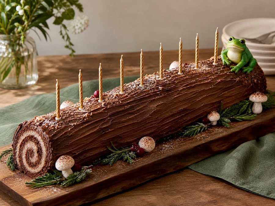
3. Multi-turn editing consistency
The claim: during longer conversations, earlier changes stay consistent and each new edit builds on previous work without degrading image quality over time.
This is precise editing extended along a second axis — not "does one edit stay local" but "does the twelfth edit still look as good as the first". The classic failure here is generational drift: each pass re-encodes the image slightly worse, and by edit eight the picture is soft, over-saturated mush that no longer resembles where you started. It is the visual equivalent of photocopying a photocopy.
OpenAI notes this matters in production workflows "where developers need to make targeted changes without rebuilding the entire asset" — which is exactly right, and exactly the thing that used to force teams back to a human designer the moment a round of revisions started. A tool that can only produce first drafts is not in the workflow; it is adjacent to it.
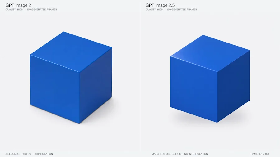
4. Intelligence and style improvements
The fourth claim covers three things that sound unrelated but are not: better understanding of complex visual instructions, more accurate real-world information inside images, and support for more complex layouts including transparent backgrounds.
The real-world-information point deserves far more attention than it will get. Image models have historically been confidently wrong about factual content rendered as pixels: a chart with plausible but invented axis labels, a map with cities in roughly the wrong places, an infographic where every number is fictional but every number looks designed. This is a genuinely dangerous failure mode, because a wrong image looks exactly as authoritative as a right one, and it is much harder to fact-check a picture than a paragraph — nobody reflexively verifies a chart the way they verify a claim in text.
"More accurate" is not "accurate". If you publish an AI-generated chart or map without checking every figure on it, you will eventually publish something false with your name on it. Treat this improvement as a reduction in how often you have to catch an error, not as permission to stop looking for them.
The style half of the claim is about drift: OpenAI says the model is more likely to retain the requested visual direction, composition and individual details "instead of drifting as instructions become more specific". That inversion — where adding detail to a prompt made results worse — has been one of the most counter-intuitive frustrations of working with these models, and it is the reason a lot of people quietly settled on short prompts and low expectations. If it is genuinely fixed, the correct prompting strategy changes, and the next section of this piece assumes it has.
The samples, from OpenAI's own page
These are OpenAI's showcase images, so read them as a vendor showing its best work rather than as a neutral test. They are still the clearest available illustration of what changed, and they reward looking at closely rather than scrolling past.
Reference photos: does the subject survive?
The clearest test of an image model is whether a real subject still reads as itself after being restyled. OpenAI shows three before-and-after pairs, and each one tests something slightly different — which is worth noticing, because the range between them is the actual story.
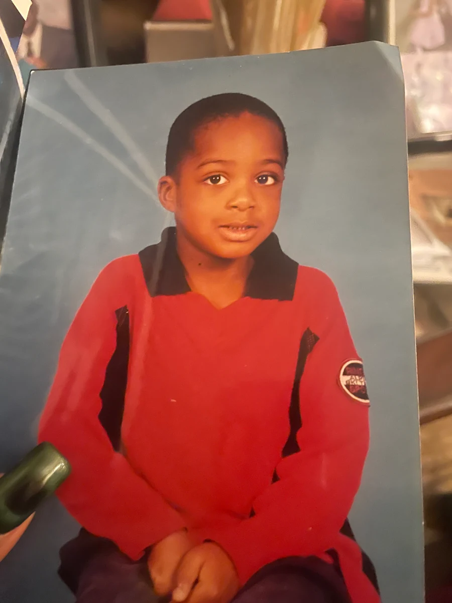
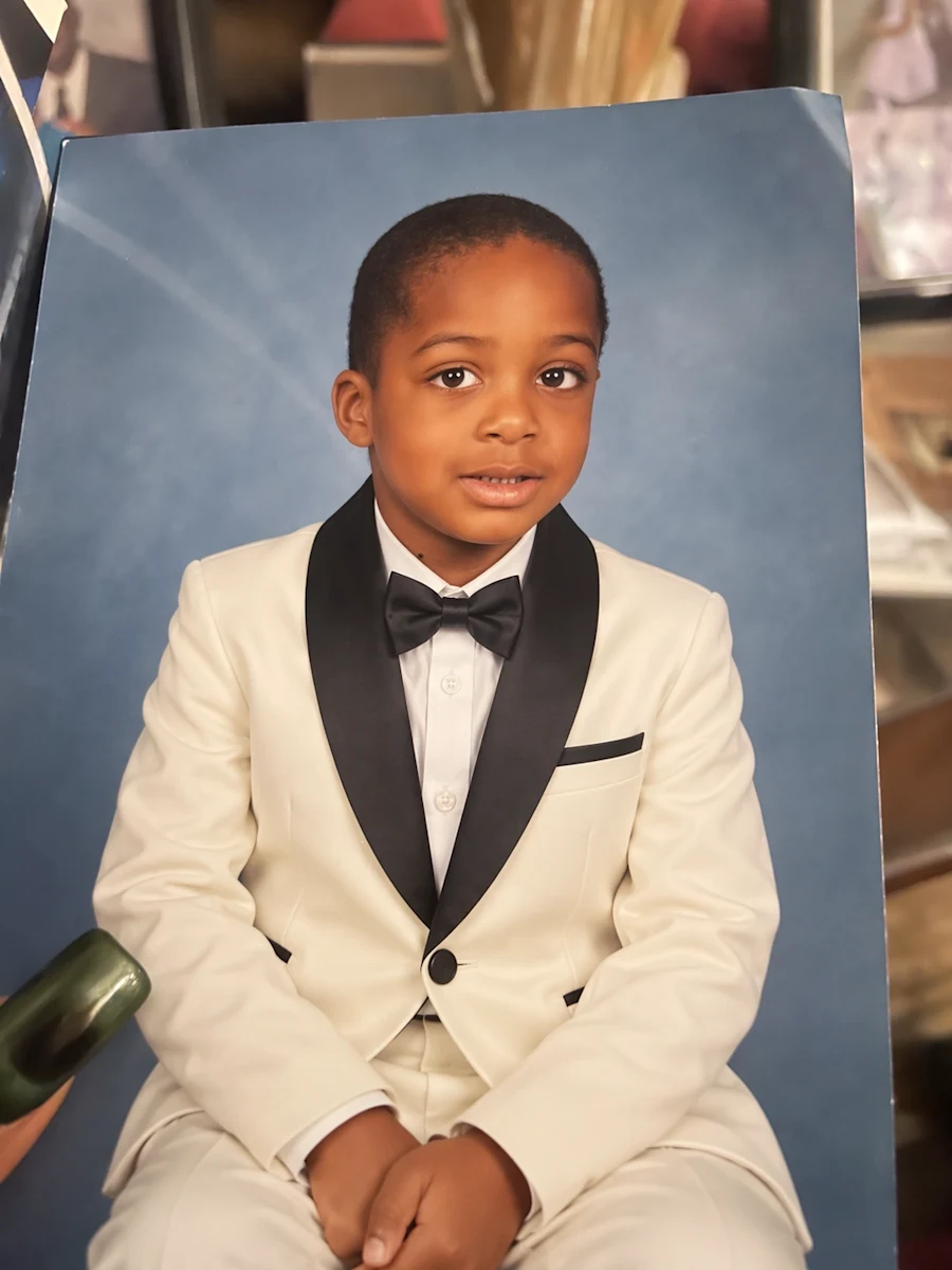
Remixed baby portrait — the hardest case. Infant faces are the most punishing subject for a generative model: the features are soft and the distinguishing details are subtle, so anything that averages towards a "generic baby" is instantly obvious to a parent and completely invisible to everyone else. The test is not whether the output is pretty. It is whether it is still the same child. Images: OpenAI
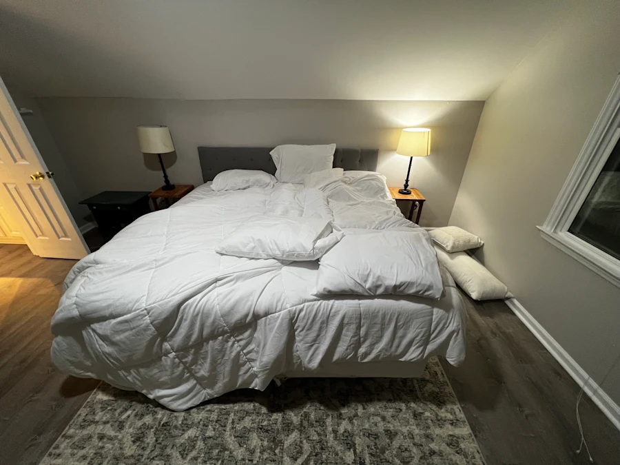
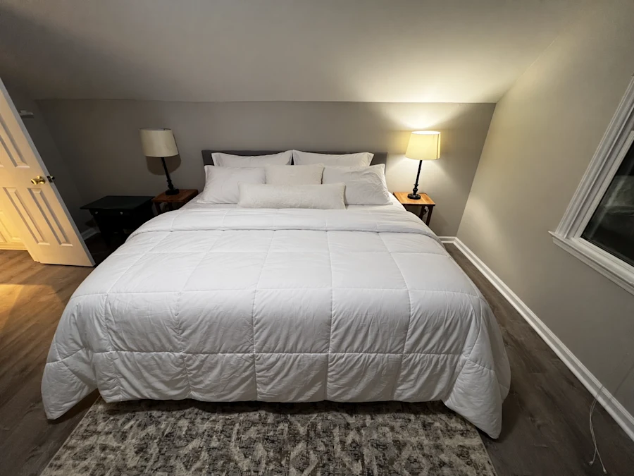
Making the bed — the precise-editing claim in one image. One thing changes; the room around it does not. Look at everything that has to stay identical for this to work: the wall colour, the light falling across the floor, every object on every surface, the exact camera position. This is the "update a single element while preserving everything else" promise, shown rather than asserted. Images: OpenAI
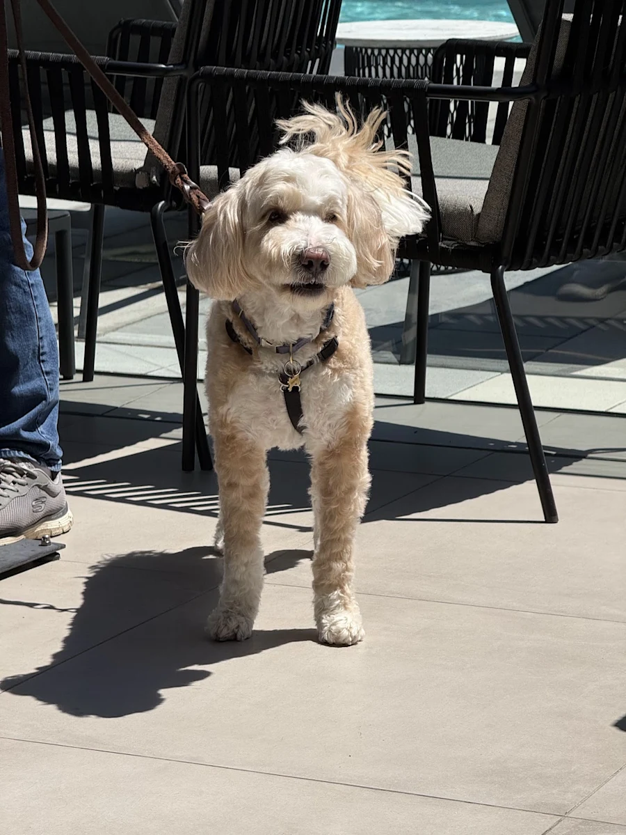
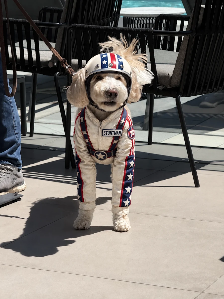
The dog as a stuntman — a heavy restyle that still has to keep the same animal. This is the opposite end of the range from the bed: almost everything changes, and the one thing that must not is the identity of the subject. A model that does well on both of these is doing two genuinely different jobs — minimal change with maximal preservation, and maximal change with minimal preservation. Images: OpenAI
The viral one: your 1980s headshot
OpenAI's page links directly to a prompt it describes as "currently going viral" — reimagining your own photo as an eighties studio portrait. That is a deliberate product choice rather than an accident of timing: the new prompt-sharing feature exists precisely so a trend like this can spread with the working recipe attached.
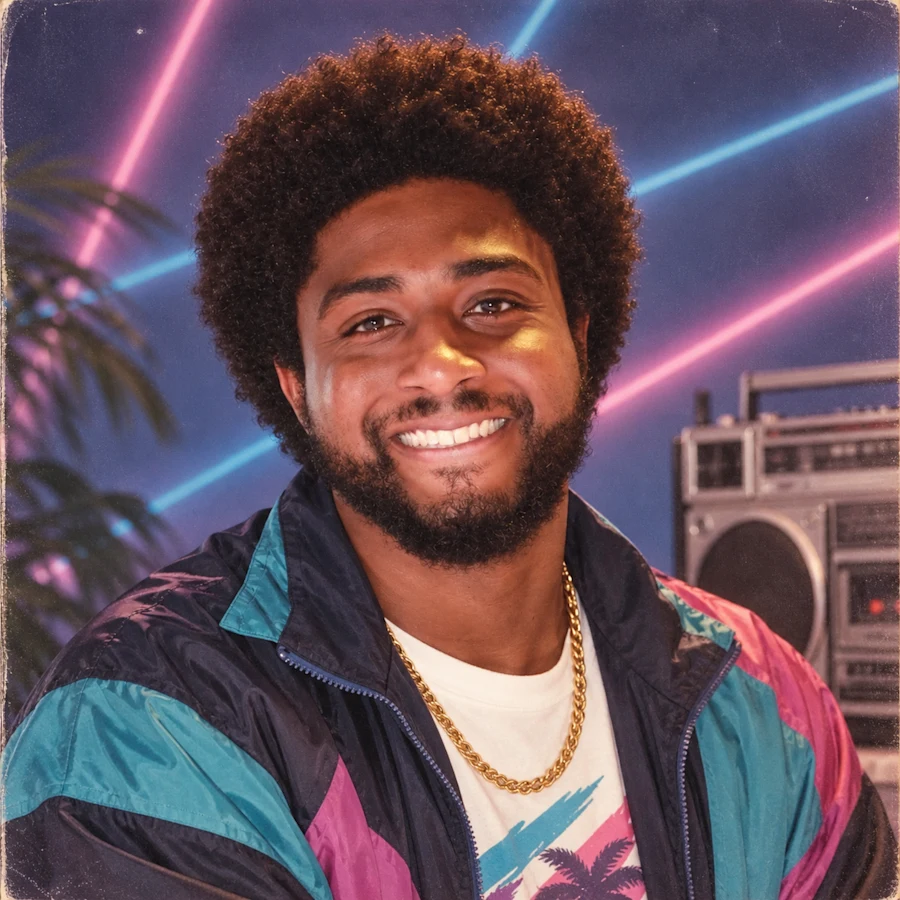
It is worth understanding why this genre of prompt works, because the reasons generalise to everything else you will do with the model. The strong ones share three properties:
- They use your photo, not a text-only description. A reference image gives the model an anchor, which is precisely what Images 2.5 got better at holding on to.
- They name every change explicitly — clothing, hairstyle, lighting, film stock, grain, background, colour cast — rather than gesturing vaguely at a decade and hoping the model shares your reference points.
- They state what must not change. "Keep the face recognisable and unaltered" is doing genuine work in these prompts, and it is the instruction most people leave out.
"Make this look like the 80s" produces mush. Naming the changes and pinning the constants produces the trend. That is the whole lesson, and it applies just as much to a product shot for a client as to a novelty portrait for a group chat.
Style range
A cross-section of the styles OpenAI showcases, which is the fastest way to see the range the model is reaching for. I have added a note on each one about what it is actually testing, because "nice picture" is not a useful reaction to a sample.
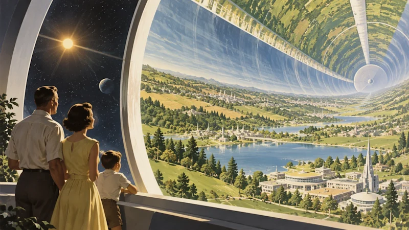
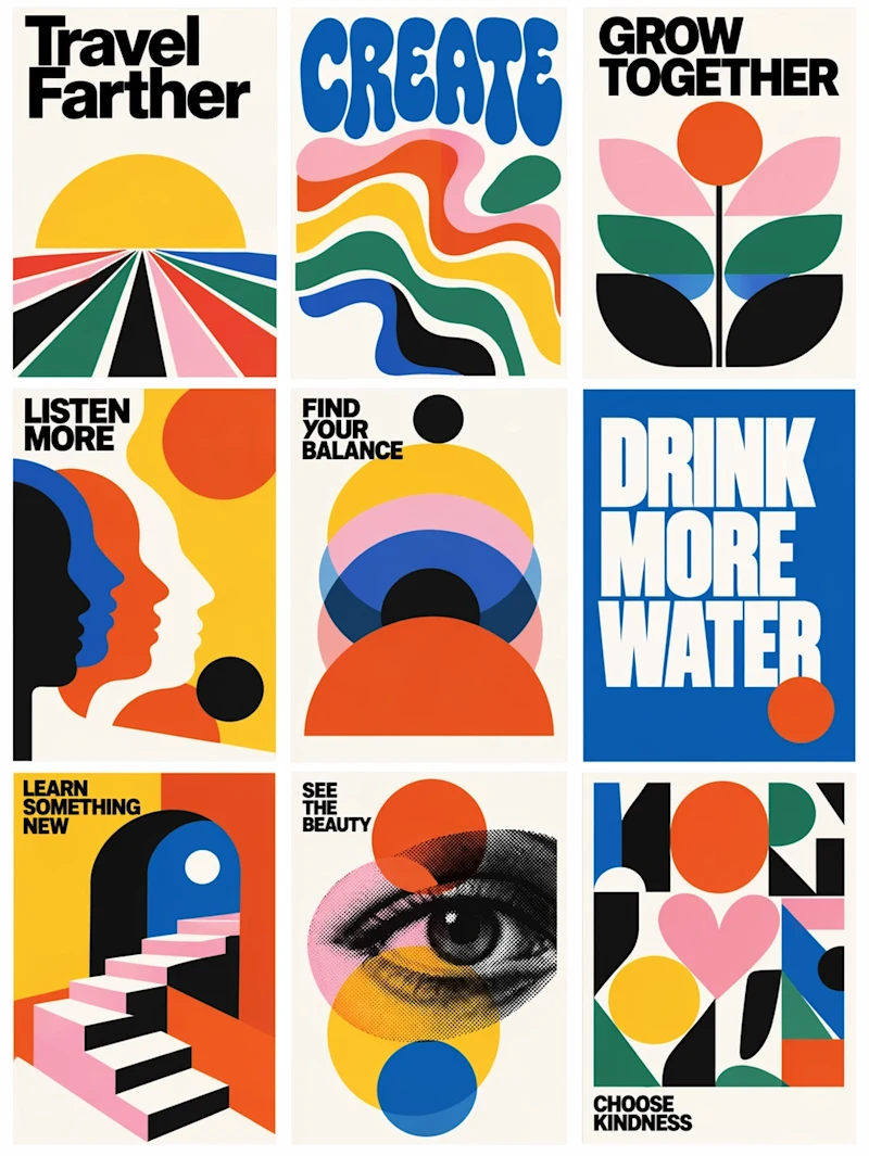
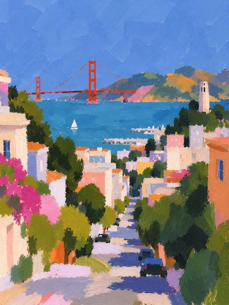
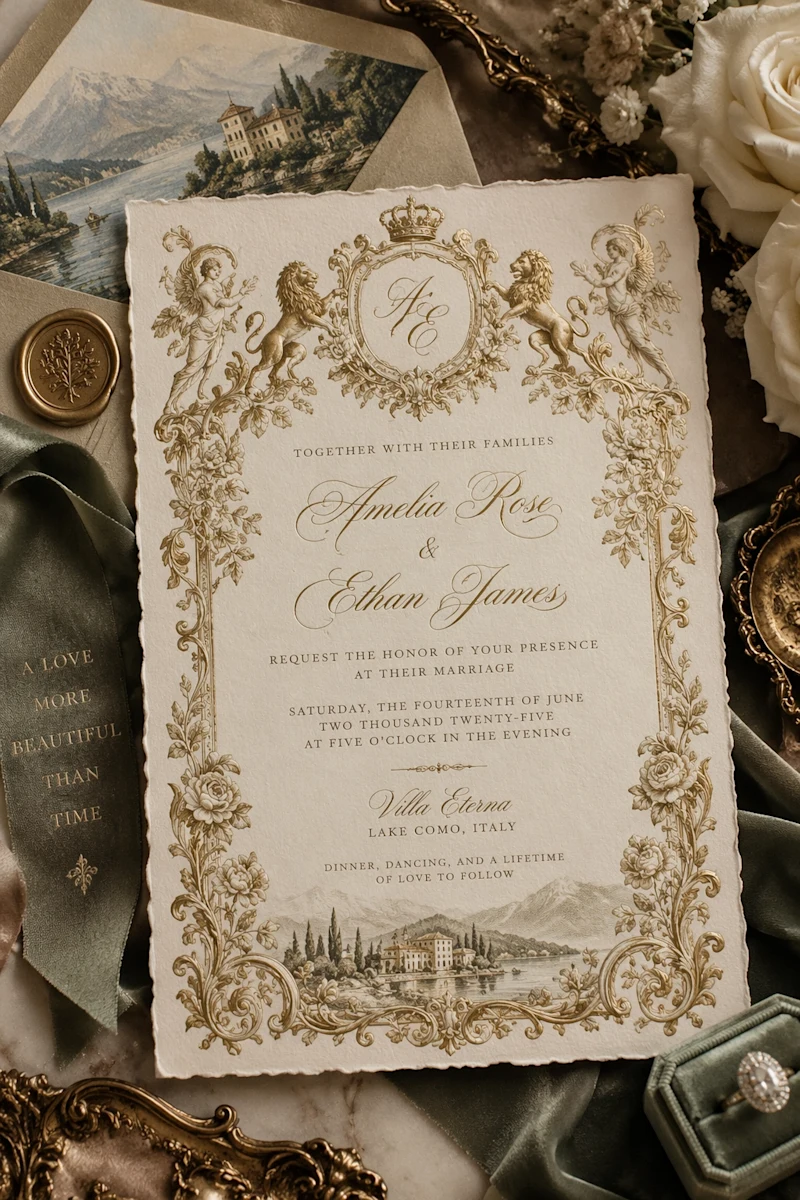
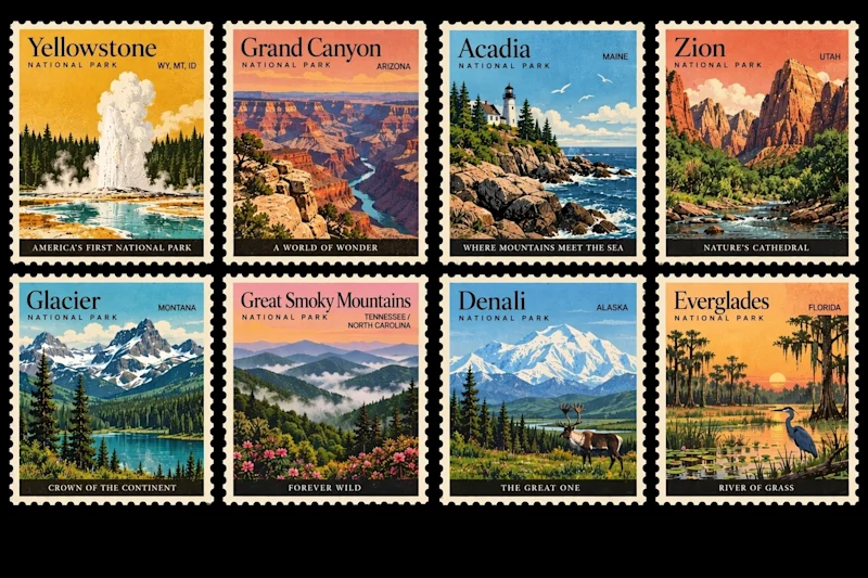
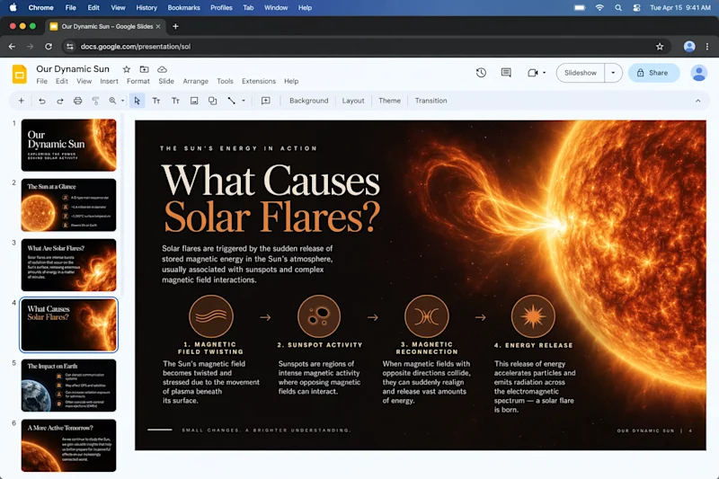
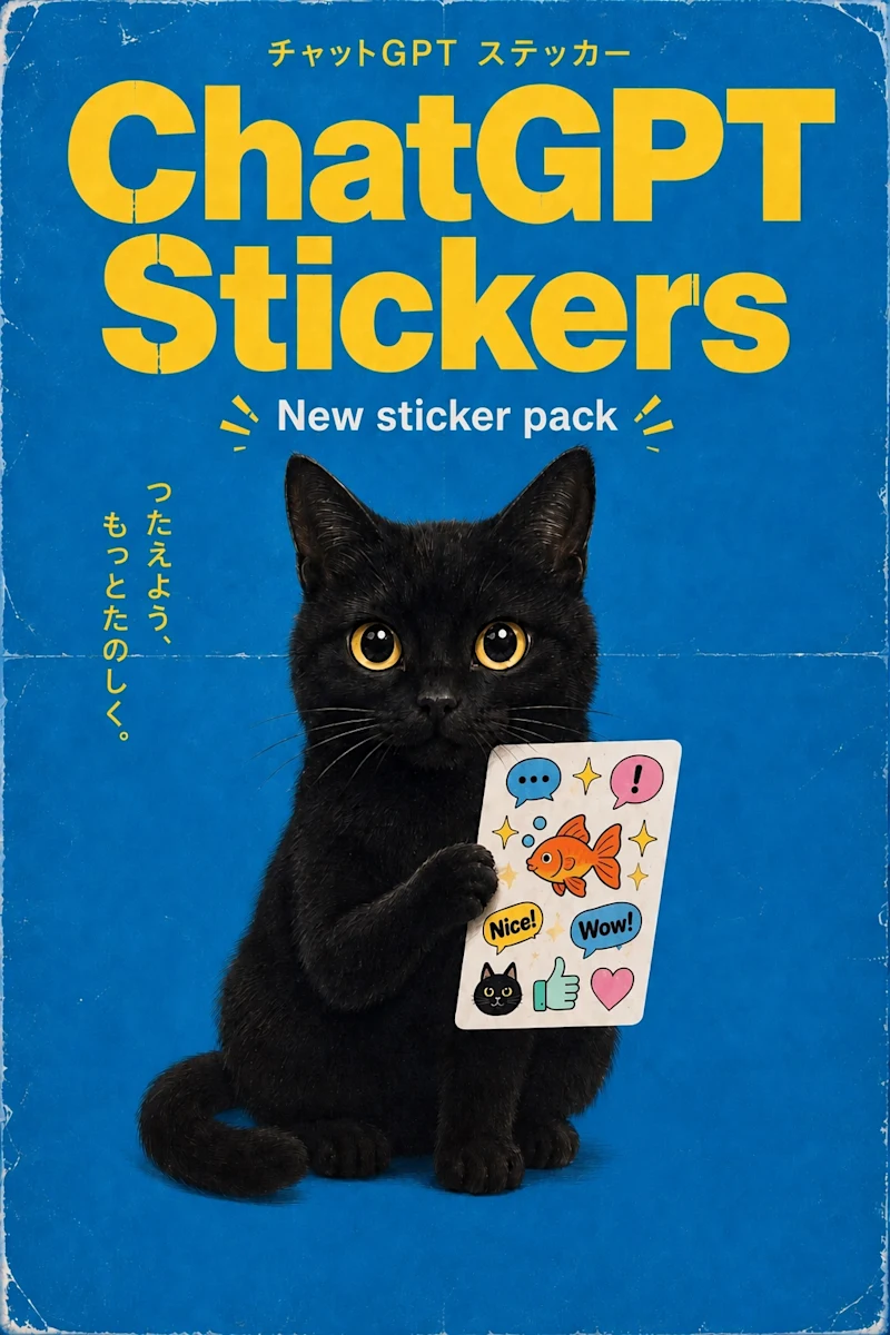
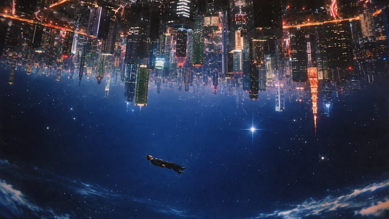
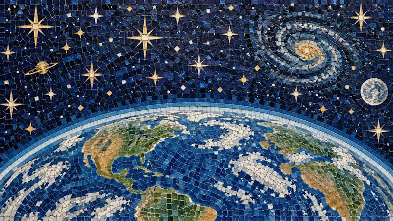
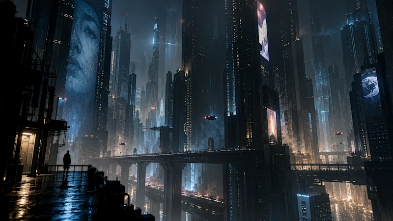
Two things I would actually watch in that set, rather than the overall prettiness:
- The typography. Legible, correctly-spelled text set inside a real layout — the invitation, the posters, the stamps — is the thing image models have been worst at for years. It fails in a distinctive way: letterforms that look like letters until you try to read them, and words that are almost the word you asked for. If this is genuinely fixed, an entire category of design work becomes reachable that previously was not.
- The transparent backgrounds. The sticker set is not showing you a nicer picture; it is showing you a different kind of output. An image with a real alpha channel drops into a design. An image of a sticker on a white square needs a person with a masking tool and twenty minutes.
Sketch: draw it instead of describing it
Sketch lets you draw directly inside ChatGPT and use the drawing as a visual guide for the final image. You open it by typing @Sketch.
The reason this matters is simple, and it is a language problem rather than a drawing problem: some things are far quicker to draw than to describe.
The layout of a room. Where the logo sits relative to the headline. Which direction a character faces. How three objects overlap and which one is in front. Describing spatial relationships in words is genuinely hard — English has to serialise something that is inherently two-dimensional, one clause at a time — and it is the single most common reason a generated image comes back right but wrong. You got the style, the mood and the subject, and the composition is simply not what you had in your head.
OpenAI's own examples are telling here: the layout of a room, the contour of an outfit you are concepting, or just a funny doodle. Two of those three are structural, which is the point.
Draw the geometry, write the style. The sketch should carry position, scale, orientation and relationship. The prompt should carry medium, lighting, palette, mood and detail. Trying to draw style, or to describe layout, is doing each job with the wrong tool.
Label your own sketch. Scrawling "sky", "logo here", "product", "empty space for copy" on the shapes removes the model's need to guess what your boxes represent. A labelled stick figure beats an unlabelled good drawing.
Do not tidy it. Time spent making the drawing neat is time not spent iterating on the result, and neatness is not the thing the model is reading.
Use it for negative space too. If a design needs a clear area for a headline or a price, draw the empty rectangle. Reserving space is almost impossible to request in prose and trivial to draw.
You genuinely do not need to draw well — OpenAI says so explicitly, and TechRadar's hands-on assessment was blunter and more useful: the tool "does look a little bit like MS Paint from 1995, but it's good enough for doing a quick sketch with your finger, or mouse". That is roughly the right expectation to set. You draw, you confirm, and ChatGPT loads a prompt to turn the rough art into a complete image.
Templates: starting from something instead of nothing
Templates replace the blank canvas with a structured starting point for the most common creative formats. OpenAI names Poster and Merch explicitly, and describes the set as covering popular formats "like flyers and product photos".
The mechanic is the genuinely useful part, and it is easy to miss in the announcement copy. A template does not simply prefill a prompt. It interviews you.
TechRadar's account of the Product photo template is the clearest description publicly available: it asks you to upload the product, then asks for a style — offering options such as Clean Studio, Editorial and Lifestyle — and then continues with further follow-up questions before generating anything at all.
Most people write bad image prompts, and it is almost never because they lack imagination. It is because they do not know which details matter. Lighting direction? Lens and depth of field? Aspect ratio? Background treatment? Mood? Where the copy is going to sit?
A template that asks the right questions is a prompt-engineering tutorial wearing the costume of a form. It does exactly what a good creative brief does in an agency: it forces the requester to specify the things the maker actually needs, before anyone wastes a round producing the wrong thing.
The second-order effect is the interesting one. People who go through the interview a few times start writing better freehand prompts, because they have internalised the shape of the question. The template teaches, and then you stop needing it.
The practical implication for a team: if you have a repeatable visual format — product shots on a consistent background, event flyers, social cards in a house style — the template flow is where you standardise it. Run it once carefully, save the resulting prompt, and you have a house recipe rather than a house rumour. That is a small piece of operational discipline that pays back every week.
Comments: point at the thing you want changed
You can now place comments directly on an image, and they function as instructions rather than as notes.
Click any element in the image and write something like "remove this" or "change this to blue", then send. ChatGPT acts on that comment against that specific region of the image.
This solves a real and consistently irritating problem: describing which part of an image you mean is much harder than pointing at it. "The third object from the left, the one partly behind the cup" is a sentence you should never have to write, and it frequently gets misread anyway — at which point you have spent a generation cycle finding out that your description was ambiguous. Pointing removes the ambiguity completely, at zero cost.
It also changes the interaction model in a way worth naming explicitly. Comments are how humans have given visual feedback to other humans for as long as there have been proofs: a circle and a note in the margin. Adopting that interface means the model now accepts feedback in the format designers, clients and stakeholders already produce it, rather than requiring somebody to translate the feedback into prose first. The translation step was where a lot of meaning used to get lost.
TechRadar flags something in Edit mode that I would rank nearly as highly as Comments itself: every edit is saved as a separate version, so you can scroll back and recover an earlier one.
Anyone who has edited an image five times and then realised version two was the good one will understand why that matters. Without history, the cost of trying a bold edit is potentially losing something that already worked — so people stop trying bold edits, and settle for the first acceptable result. With history, exploration becomes free.
This is precisely the reason version control changed how software gets written. It was never primarily about recovering from disaster; it was about making experiments cheap enough that people run them.
Prompt sharing: the distribution mechanic
When you share an image, you can now choose to include the prompt that produced it, so someone else can run the same idea with their own photos and their own details.
Read this as a product and distribution decision as much as a creative feature. Image trends have always spread by people pasting prompts into comment threads and screenshots of prompts into group chats; OpenAI has simply made that loop native, frictionless and attributable. Every shared image now potentially carries a working recipe back into ChatGPT, along with the person who made it.
It is worth being clear-eyed that this is a growth mechanism wearing a creative feature's face — the '80s headshot trend that OpenAI links from its own announcement page is the proof of concept, and linking to it from the launch post is not subtle. That does not make it a bad feature. It makes it an effective one, and effective is the thing you should be paying attention to.
A shareable prompt is now a distributable asset in its own right.
Think about the properties. A prompt is tiny. It is free to copy. It produces a personalised output for whoever runs it, which is the single strongest driver of sharing there is. And it now travels with an attribution surface attached rather than being stripped of its origin the moment someone copies it.
If you build a genuinely good one for your niche — a specific industry's product shots, a recognisable visual format, a novelty that flatters the person running it — it can travel considerably further than the image it produced. This is the closest thing to a new organic distribution channel that has appeared in AI tooling in a while, and almost nobody is treating it as one yet.
How to actually get good results
The model changes shift what a good prompt looks like. Five patterns that follow directly from what shipped, rather than generic prompting advice that predates it.
1. Anchor with a reference image whenever you can
The biggest fidelity improvement in this release is in reference-led work. A prompt with an attached photo is operating in the regime the model specifically got better at; a text-only prompt is not. If there is a real product, place, room or person involved in what you are making, start from the photograph rather than from a description of the photograph.
2. Say what must not change
Precise editing is a capability, but it still needs to be told what the constants are. "Change the background to studio grey, keep the product, its label and the lighting on it exactly as they are" is a materially better instruction than "put this on a grey background". You are naming the preserve-list explicitly rather than hoping it will be inferred — and the model is now much better at honouring a preserve-list than it used to be, which makes stating one worth the extra clause.
3. Make one change per turn
Multi-turn consistency is the headline workflow improvement, so use it as designed. Bundling five changes into one instruction gives you a single output to accept or reject wholesale. Five single-change turns give you five checkpoints — and, with version history, the ability to keep the first four and redo only the fifth. The bundled approach was a workaround for models that degraded across turns. That workaround is now costing you rather than saving you.
4. Point rather than describe
If the change is spatial, use Comments. If the composition is spatial, use Sketch. Reserve prose for the things prose is genuinely good at: style, mood, medium, palette, materials, era, lighting quality, emotional register. The moment you catch yourself typing "the one on the left, next to the…", stop and point instead.
5. Ask for the output format you need, not the picture you can see
Transparent backgrounds are now explicitly supported. If the end use is a logo, an icon, a sticker or any element that will sit on top of something else, say so, and ask for transparency directly. The difference between an asset and a screenshot of an asset is an hour of somebody's afternoon, repeated every time you need it.
Do not treat faster generation as a reason to generate more. The constraint on visual content was never production speed — it was having something worth showing. Halving the time to produce an image does not halve the time it takes to have an idea.
The teams who get real value from this release will be the ones who spend the extra iterations making one image genuinely right. The ones who spend them shipping four times as many mediocre images will get four times as much mediocre content, and will conclude the model did not help.
The two new API models
For developers, Images 2.5 arrives in the API as two models with a deliberately clear split. OpenAI's framing is that developers are already building image generation into products used by creative, marketing, retail and media teams every day — so the split is by workload, not by customer tier.
| GPT‑Image‑2.5 Flare | GPT‑Image‑2.5 Sunburst | |
|---|---|---|
| Position | The default choice for most applications | Premium visual workflows |
| Versus GPT‑Image‑2 | Higher-quality images at 50% lower latency | An extra level of precision for detailed creative work |
| Speed | Fast | Longer generation times |
| Control across edits | Good | Tighter — the explicit reason it exists |
| Best for | Creator and social content, product experiences, visual search, rapid image prototyping, high-volume generation | Production-ready campaign creative, polished product imagery, detailed editing workflows |
| Wrong for | Final campaign artwork that will be scrutinised at full size | Anything user-facing and interactive where a person is waiting |
How to choose between them
The useful question is not "which is better" — it is "is a human waiting?"
If a user is sitting inside your product watching a spinner, latency is a feature and Flare is almost certainly right. If the output is going into a campaign that a brand team will review at full resolution, and a few extra seconds cost nothing because the review takes a day anyway, Sunburst's tighter control is worth having.
Most real products need both, in different places: Flare for exploration, previews and the twenty variations a user flicks through; Sunburst for the final render once someone has committed to a direction. Routing by stage rather than by preference is almost always the right architecture, and it is the same pattern that works for text models.
What the early customers actually said
The launch quotes are more informative than usual, because each team named the specific property they cared about rather than offering generic praise.
- Higgsfield AI — Axultan Alimkulov, Head of Product — singled out how well Flare "understands what not to change": making a meaningful edit without losing the character, composition or visual identity of the original image. They tie this directly to how creators and teams actually work across film, UGC and advertising, and add that combining that control with the speed, quality and cost is what makes it stand out.
- Adobe — Matt Chotin, Senior Director, Product — has the GPT‑Image‑2.5 models in Firefly, citing faster generation and "resolution consistency that keep images sharp and photorealistic through every refinement". Note the phrase through every refinement: that is the multi-turn claim, endorsed by a partner with an enormous amount to lose from getting it wrong.
- Manus — Lucky Liao, Evaluation Team — supplies the one hard third-party number in the whole announcement: in their evaluations, Flare delivers high-quality images at two to four times the speed of GPT‑Image‑2. They also call out improved transparent-background generation as the reason it fits their work on brand assets, presentations and websites.
Notice that two of the three led with speed and consistency rather than raw quality. That is a fair one-line summary of this release: it is a workflow release with a quality bump attached, not the other way round.
Costing it properly
If you are budgeting an image workflow, the same logic applies as with text models: the per-image price is rarely the number that decides your bill. What decides it is how many generations you need before you get one you can actually ship — and a model that is twice as fast but needs three attempts is not faster in any way that matters to you.
Latency also carries a cost that never appears on an invoice: if a user waits twenty seconds, some fraction of them leave, and that fraction is usually larger than anyone's estimate. I have worked the general version of this through in cost per task, not cost per token, and the reasoning transfers to images almost unchanged.
Provenance, watermarking and safety
OpenAI says Images 2.5 builds on its existing safeguards, with checks on both prompts and images to help prevent harmful outputs, and points to a system card for the full evaluation detail. On provenance, two mechanisms carry over from previous models:
- C2PA metadata — an industry-standard provenance record embedded in the file, recording how the image was made and by what. It is the same standard camera manufacturers and Adobe have been building toward for years, and when it survives it is genuinely useful.
- Invisible watermarking — a signal embedded in the pixels themselves, which survives some processing that destroys metadata entirely.
An honest caveat, because this is the part that gets overstated in most coverage: C2PA metadata is trivially stripped. Screenshot the image and it is gone. Re-encode it, run it through most social platforms' image pipelines, paste it into a document and export — gone. The invisible watermark is considerably more durable, but "more durable" is not "indestructible", and anyone motivated enough to remove it is not the person these measures were designed to stop.
These measures make casual attribution possible. They let a well-behaved platform label a well-behaved upload, and they let an honest creator prove what they made. That is worth having and worth supporting.
They do not make deception hard for anyone motivated. Treat the presence of C2PA data as weak positive evidence, and its absence as no evidence at all — because absence is the normal state for any image that has been through a screenshot, a social platform, or a re-save. Reading "no C2PA data" as "not AI-generated" is the most common mistake people make about this technology.
If you publish, the practical implication is direct: your disclosure practice cannot depend on the metadata surviving. Label generated imagery in your own copy, in your own CMS, where you control it and where it will still be there next year.
What the launch did not tell us
Worth cataloguing, because the gaps in an announcement are often the most informative part of it.
| Open question | Why it matters |
|---|---|
| No published benchmark scores | Image quality is genuinely hard to benchmark, but the absence means every quality claim rests on samples the vendor chose |
| No API pricing in the announcement | Latency is only half of a cost decision; the pricing page is where the other half lives |
| "Up to 50%" is a ceiling, not an average | Real-world speed-up depends on size, complexity and system load. Manus's two-to-four-times figure is a more useful independent anchor |
| Per-tier usage limits unstated | "All tiers" is about access, not volume — free-tier caps will decide who can genuinely work this way |
| No comparison against competing models | OpenAI compares Images 2.5 to Images 2.0 throughout, and never to anyone else's current model |
| Template list not fully enumerated | Poster, Merch, flyers and product photos are named; the full set will surface as people use it |
| Watermark robustness not quantified | "Invisible watermarking" without a stated survival rate is a description, not a guarantee |
| No detail on Sunburst's speed penalty | "Longer generation times" could mean 20% or 300%, and that decides whether it fits your product |
None of these are scandals. They are the ordinary shape of a product announcement, and the reason to list them is so you know which parts of your own planning are resting on assertion rather than on evidence.
What this actually changes for marketing work
Setting the samples aside, five practical consequences for anyone who makes visual content for a living.
1. Iteration got cheap enough to change behaviour. Halved latency means you try eight versions instead of three — and version eight is usually better than version three. This is the change that quietly improves output quality more than any of the model improvements do, because it changes what you are willing to do rather than what the model is able to do.
2. Editing beats regenerating. Comments plus multi-turn consistency turn the workflow into "fix this one thing" rather than "roll the dice again". That is how a designer works, and it is the first time the tool has fitted that shape.
3. Transparent backgrounds turn outputs into assets. A logo, a sticker, a product cut-out you can place — not a picture you then have to mask. This removes an entire manual step from the pipeline, every single time.
4. Prompts are now shareable artefacts. A good prompt for your niche is a piece of distributable content, with a distribution mechanism built into the product that produced it.
5. The brief moved into the tool. Templates ask the questions a creative brief asks. Over time that raises the floor on what non-designers produce, which changes what a designer's time is best spent on — less first-draft production, more direction and judgement.
And the caution, because it is the same one as always: a faster way to make images is not a reason to make more of them. Removing the production bottleneck mostly reveals whether you had an idea. That is the same argument I make about text in how AI systems choose what to cite — cheap generation raises the value of judgement rather than lowering it, precisely because judgement is the part that did not get cheaper.
A 60-minute way to evaluate it yourself
Vendor samples show you the ceiling. If you want the floor — which is the number that should actually drive your decisions — here is a short protocol that will tell you more than any announcement can.
- Minutes 0–10 — the identity test. Take a photo of a real person you know well, or your actual product. Restyle it three ways. Ask someone else who knows the subject whether it still looks like them. This tests the headline fidelity claim on your own data rather than OpenAI's.
- Minutes 10–20 — the ten-edit test. Take one image and make ten successive single-element edits. Compare edit ten with edit one. Any degradation you can see is the multi-turn claim failing on your particular workload.
- Minutes 20–30 — the typography test. Ask for a poster with a specific headline, subhead and date. Check every single character. This is historically the weakest area and the fastest way to find the current limit.
- Minutes 30–40 — the Sketch test. Draw a layout you have previously failed to get out of the model through words alone. If Sketch nails a composition that prose could not, that alone justifies the release for you.
- Minutes 40–50 — the asset test. Request something on a transparent background and drop it straight into a real design. Note honestly whether you needed to touch it afterwards.
- Minutes 50–60 — the facts test. Generate an infographic containing real figures you know cold. Check every number and every label. Then decide your own policy on publishing generated informational graphics based on what you found, not on what the announcement said.
Write down what you find. In six months there will be another release with another version number, and the only way to know whether it actually improved anything for you is to have your own baseline to compare it against.
FAQ
What is ChatGPT Images 2.5?
ChatGPT Images 2.5 is OpenAI's image generation model released on 8 September 2026, replacing Images 2.0. It produces sharper detail with more natural lighting and richer textures, preserves subjects from reference photos more reliably, follows editing instructions more precisely across multiple turns without degrading quality, and generates up to 50% faster than Images 2.0. It also introduces four new tools in ChatGPT: Sketch, Templates, Comments and prompt sharing.
When was ChatGPT Images 2.5 released?
8 September 2026. It began rolling out the same day to ChatGPT, ChatGPT Work and Codex users across all tiers on desktop, mobile and web. The previous model, Images 2.0, shipped in April 2026 — roughly a five-month gap between releases.
Is ChatGPT Images 2.5 free?
Access is not restricted to paid plans. OpenAI says it is available to all ChatGPT, ChatGPT Work and Codex users across all tiers, on desktop, mobile and web. Usage limits still differ by plan as they always have, and OpenAI did not publish per-tier image caps in the announcement. In the API it is available as two paid models, GPT-Image-2.5 Flare and GPT-Image-2.5 Sunburst.
How much faster is ChatGPT Images 2.5?
OpenAI reports image generation latency reduced by up to 50% compared with Images 2.0. "Up to" is a ceiling rather than an average, so real-world results will vary with image size, complexity and system load. Independently, Manus reported in their own evaluations that GPT-Image-2.5 Flare delivers high-quality images at two to four times the speed of GPT-Image-2.
What is the Sketch feature in ChatGPT?
Sketch lets you draw directly inside ChatGPT and use that drawing as a visual guide for the generated image. You open it by typing @Sketch. It is designed for rough layouts rather than finished art — the sketch supplies structure, position and composition while your prompt supplies style, lighting and detail. It solves the common problem that spatial relationships are difficult to describe accurately in words. OpenAI's own examples include sketching the layout of a room or the contour of an outfit you are concepting.
How do Comments work on ChatGPT images?
You click directly on an element of an image and write an instruction such as "remove this" or "change this to blue", then send. ChatGPT acts on that comment against that specific region rather than treating it as a note to read. It removes the ambiguity of describing in words which part of an image you mean. Edit mode also saves each edit as a separate version, so you can scroll back and recover an earlier one.
What are ChatGPT image Templates?
Templates are preset starting points for popular creative formats such as Poster, Merch, flyers and product photos, replacing the blank prompt box. Rather than simply prefilling text, a template asks you follow-up questions — the Product photo template, for example, asks you to upload the product and then offers style choices such as Clean Studio, Editorial and Lifestyle before continuing. In effect it works like a creative brief, making you specify the details that actually determine the result.
What is prompt sharing in ChatGPT Images 2.5?
When you share an image you can now choose to include the prompt that produced it, so someone else can run the same idea with their own photos and details. It makes image trends spread with a working recipe attached rather than requiring people to paste prompts into comment threads, and it effectively turns a well-crafted prompt into a distributable asset in its own right.
What is the difference between GPT-Image-2.5 Flare and Sunburst?
Flare is the default choice for most applications, delivering higher-quality images than GPT-Image-2 at 50% lower latency, and suits creator and social content, product experiences, visual search, rapid prototyping and high-volume generation. Sunburst is built for premium visual workflows that benefit from tighter control across edits — production-ready campaign creative and polished product imagery — and has longer generation times. The practical question when choosing is whether a human is waiting: if so, use Flare.
Is ChatGPT Images 2.5 good at text and typography?
OpenAI's samples include designed pieces with legible set type — wedding invitations, mid-century posters and vintage stamp designs — and the announcement claims better handling of complex layouts and complex visual instructions. Rendering correct, well-set text has historically been the most reliable failure of image models, so it is worth testing on your own content before trusting it: ask for a poster with a specific headline, subhead and date, then check every character.
Can ChatGPT Images 2.5 make transparent backgrounds?
Yes. OpenAI states the model handles more complex layouts including transparent backgrounds, and Manus specifically cited improved transparent-background generation as a reason it fits their brand-asset, presentation and website work. This is what makes outputs usable as design assets — a logo, icon or sticker with a real alpha channel drops straight into a layout, whereas an image of one on a white square needs manual masking first.
Can you tell if an image was made with ChatGPT Images 2.5?
Sometimes. OpenAI embeds C2PA provenance metadata and applies invisible watermarking to help identify images made with its tools. However, C2PA metadata is easily stripped by screenshotting, re-encoding, or passing the file through most social platforms, and while the invisible watermark is more durable it is not indestructible. Treat the presence of C2PA data as weak positive evidence and its absence as no evidence at all. These measures support casual attribution rather than making deliberate deception difficult.
Should I use ChatGPT Images 2.5 for published infographics and charts?
Only with full manual verification of every figure. OpenAI says images containing real-world information now have more accurate content, but "more accurate" is not "accurate", and a wrong image looks exactly as authoritative as a right one while being much harder to fact-check than a paragraph. If you publish generated informational graphics, check every number and label yourself, and disclose in your own CMS rather than relying on embedded metadata to survive.
How should I prompt ChatGPT Images 2.5 differently from older models?
Five changes follow from what shipped: attach a reference photo whenever a real subject is involved, since reference-led work is where the fidelity gains are; state explicitly what must not change, not just what should; make one change per turn rather than bundling edits, because multi-turn consistency now rewards that; use Sketch and Comments for anything spatial instead of describing position in prose; and ask directly for transparency when the output needs to sit on top of something else.
- OpenAI, Introducing ChatGPT Images 2.5 — the announcement: all feature descriptions, sample images, partner quotes, API model definitions, safety measures and availability
- OpenAI on X, the launch post — 8 September 2026
- Graham Barlow, TechRadar, ChatGPT Images 2.5 is out — the 3 new features you'll actually use — 24-hour hands-on covering Comments, version history, Sketch and the Templates interview flow, plus the Images 2.0 comparison context
- Jayant Solanki, GPT-6 Astra: what shipped and what real tests show — the text-model release from the same cycle